
Get monthly notifications
Easy navigation
Navigating through your website should be as smooth as possible and every visitor should be able to find what they’re looking for – instantly. Use a clean, nice-looking layout and use the same layout for every page.
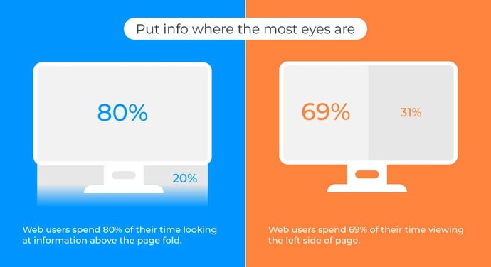
People visiting a website today will spend around 80% of their time looking at the information that is placed above the page fold, so keep the design user-friendly with a navigation bar available on all pages.
Here's where web users focus their eyes online
Also, make sure to have contact information available on clear display. Your visitor should never have to worry about finding an email address or telephone number, so make it as easy as possible and put it on every page.
Only useful information
Keep the information relevant! There’s a 58% increase in web usability when webmasters reduce the number of words on the website in half. Cut down the amount of text since visitors will only read about one-third of it. Make sure to use a clear language and, obviously, that there are no misspellings. You should also make it effortless to navigate back to the home page from wherever the visitor might find themselves on your website.
A structured Contact page
Since the last thing you want to do is scaring your visitors away, you want to avoid having an opt-in module on your home page. If a visitor is there for the first time, they probably won’t appreciate if the first thing they see is a pop-up asking for their email address. Instead, let visitors get to know your business first and put an opt-in module on the Contact page instead.
When a visitor goes to your Contact Page they clearly have some interest in your company, so besides an opt-in module, add a call to action (CTA) to this page. Make sure you have all the necessary contact information presented here and that it’s easy to opt-in or to enter a message in an email module.
Useful visual content
Every website should have a picture of its owner. It works with a professional headshot, but an even better idea is to present them more relaxed, like a picture of the owner at work in the office environment on a regular workday. Videos can also be a great way to add some interactivity to your website.
If you’re cooperating with other businesses or have memberships, adding their logos to your website will bring further confidence in your company. Also, add logos such as Web of Trust (WOT) to further increase confidence in your e-commerce.
Landing page guidelines
Every e-commerce needs an online marketing plan, and everyone involved in online marketing knows that the landing page is essential. It’s used for lead generation and the actions someone takes on your landing page will determine an advertiser’s conversion rate. What most advertisers look for in a landing page is to convert the visitors into leads or sales.
If you haven’t decided on which e-commerce platform you should use yet, look no further: this article covers it - The difference between the most common e-commerce platforms.
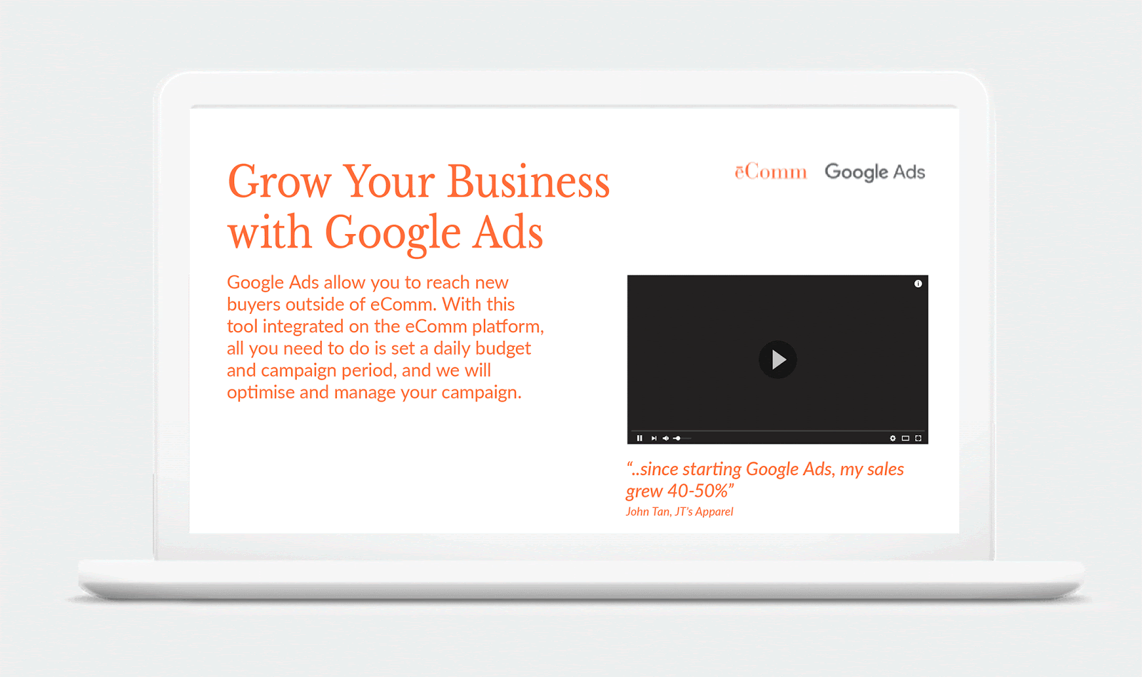
So you want to make sure to introduce your customers to Google Ads. In the example above, Google have used “eComm” as an example partner, which is an ecommerce marketplace that offers Google Ads to their merchants in a way to help them generate sales and traffic to their sites. When you’re creating a landing page, the above slides provide you with some valuable tips.
Be there for your visitors
As speed is of essence today, the load time of your website needs to be quick. Visitors today expect pages to load in two seconds or less. Many will leave the website if it takes more than three seconds. And if your website is more than 250 milliseconds slower than a competing website, people will visit your site less frequently.
Also, make the user experience as pleasant as possible for visitors by helping them out in any way possible. Add content that offers them free advice and valuable information. You want to make it as easy as possible for your visitors to perform the most desired action (MDA), so keep that in mind to make it as easy for them to convert as possible.
Now that you have a great on-site experience for your e-commerce, you might want to know how to work with digital marketing in the best possible way? Don’t worry, we’ve got you covered: High-level guide to marketing for e-commerce.
Featured Articles
The Full Funnel Approach and Pinterest
Today, we're going to delve into the significance of working with a full-funnel strategy and understanding why a comprehensive media mix is crucial. We'll also explore an example of how this approach and including Pinterest in the media mix led to a significant decrease in the cost of sales for Houdini.
Master Text Overlays: Boost Ad Engagement
In recent years, capturing the attention of your target audience has become more challenging than ever. Businesses and marketers are constantly on the lookout for innovative ways to stand out in the crowded advertising landscape.
One effective technique to draw attention to your ad's message is through the use of text overlays on image and video ads. In this blog, we will explore the best practices for incorporating text overlays, ensuring your message is impactful without compromising the visual appeal of your ads.